#Deep #Dive #Timeless #Allure #Scandinavian #MidCentury #Design
A Deep Dive into the Timeless Allure of Scandinavian Mid-Century Design
Embarking on a journey through the world of interior design, one is bound to encounter the enduring charm and timeless sophistication of Scandinavian Mid-Century Design, or Mid-Century Modern style. Born in the post-World War II era, this movement has etched its mark on the design landscape, thanks to luminaries like Arne Jacobsen, Alvar Aalto, and Hans Wegner.
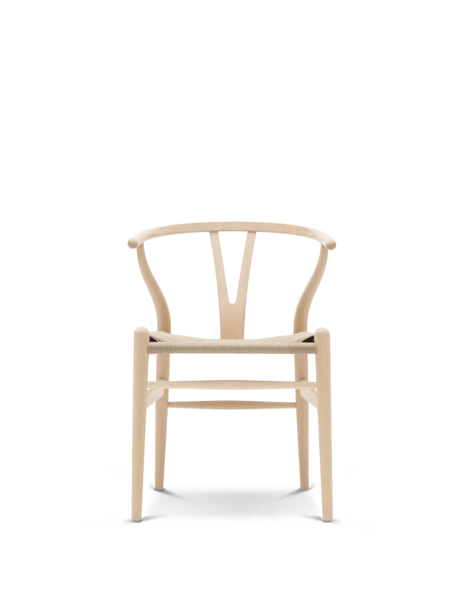
This CH24 Wishbone Chair from Carl Hansen’s Hans J Wegner is an iconic part of Scandinavian design history. It is available today on Styylish. This timeless piece has been in continuous production since its inception in 1950. It epitomizes Scandinavian’s emphasis on fine craftsmanship, with its manufacturing process consists of over 100 steps. The CH24 is about style, sophistication, and durability – three staple characteristics of Scandinavian design.
History of Scandinavian Mid-Century Design Style
The history of Scandinavian Mid-Century Design is intertwined with a period of significant societal and economic change. In the aftermath of World War II, Scandinavia faced the challenges of reconstruction and sought to infuse a sense of optimism and modernity into everyday life. This backdrop set the stage for a design style revolution that prioritized simplicity, functionality, and a connection to nature.
Post-War Optimism
The post-war era was marked by a collective desire for renewal and progress. Scandinavian design is deeply influenced by the modernist movement and embraces the belief that good design could enhance the quality of life. This optimism fueled the creation of pieces that were not just functional but also visually striking. This resulted in incredibly high quality furniture of natural materials and solid wood.
Craftsmanship and Materials
Mid-Century Modern designers were craftsmen at heart. They valued traditional craftsmanship while embracing innovation. The use of high-quality materials, such as teak, rosewood, and laminated wood, became a hallmark of the movement. Designers sought to showcase the natural beauty of these materials, fostering a connection to the environment.
Iconic Designs
The mid-20th century witnessed the birth of some of the most iconic designs in furniture history. Arne Jacobsen’s Egg Chair, Alvar Aalto’s Paimio Chair, and Hans Wegner’s Wishbone Chair are just a few examples of pieces that have transcended time, becoming symbols of the Scandinavian Mid-Century modern style aesthetic.
International Recognition
As Scandinavian Mid-Century Design gained international recognition, it became synonymous with a lifestyle that blended form and function seamlessly. The clean lines, organic shapes, and commitment to simplicity appealed to a global audience, solidifying its place as a design movement of global significance.
Why Choose Scandinavian Mid-Century Modern Design for Your Home?
- Timeless Elegance: The design principles laid down by the pioneers of Scandinavian Mid-Century Design have proven to be timeless. The clean lines, natural materials and minimalist aesthetic ensure that pieces inspired by this movement maintain their elegance and relevance through the years.
- Functionality and Practicality: In the true spirit of Scandinavian design, Mid-Century pieces prioritize functionality without compromising on style. Tables, chairs, sideboards, and other furnishings are not merely decorative; they are designed to enhance the everyday living experience.
- Versatility in Complementing Other Styles: The versatility of Scandinavian Mid-Century Design is a key factor in its enduring popularity. Whether your home leans towards modern, eclectic, or traditional design, integrating Scandinavian Mid-Century pieces effortlessly bridges the stylistic gap, creating a cohesive and harmonious interior.
Characteristics of Scandinavian Mid-Century Furniture
Tables
Whether it’s a coffee table or a dining table, Scandinavian style tables are characterized by clean lines, simple geometric shapes, and a focus on functionality. Wooden surfaces, often crafted from teak or oak, provide warmth and a connection to nature. Tapered legs and subtle detailing contribute to the overall minimalist aesthetic.
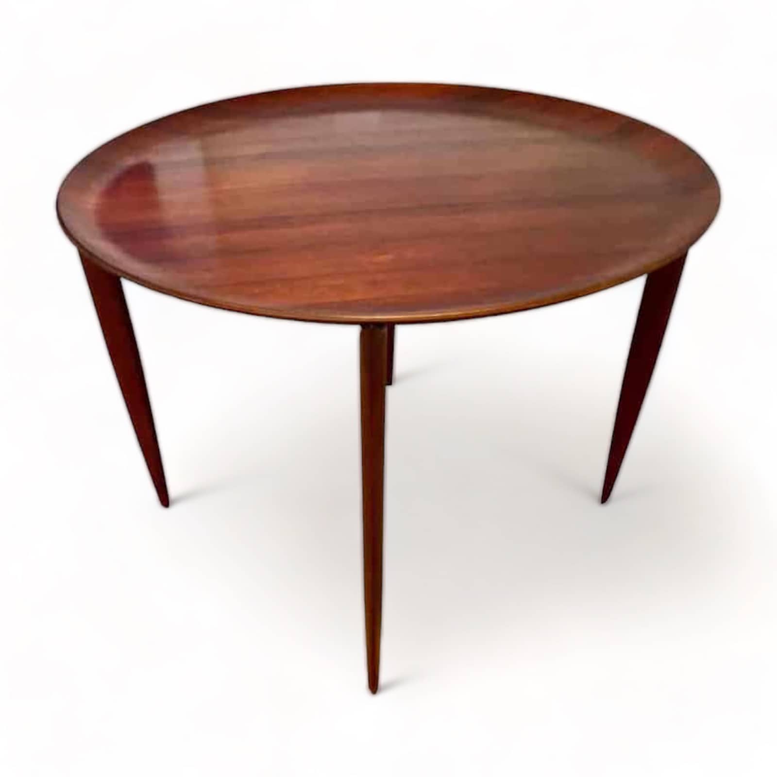
For example, this teak wood accent table is an iconic design of well-known Scandinavian designer, Fritz Hansen in 1958. It comes in two parts, with a foldable table base and the table top which can alternatively be used as a tray. As with most Scandinavian furniture, this piece was built to have longevity and has high-level craftsmanship.

Chairs
Mid-Century Modern chairs epitomize the organic forms and ergonomic design. The harmonious blend of wood and upholstery not only provides comfort but also adds visual appeal to any space. Scandinavian design is known in particular for the style’s innovative chair and seating pieces.
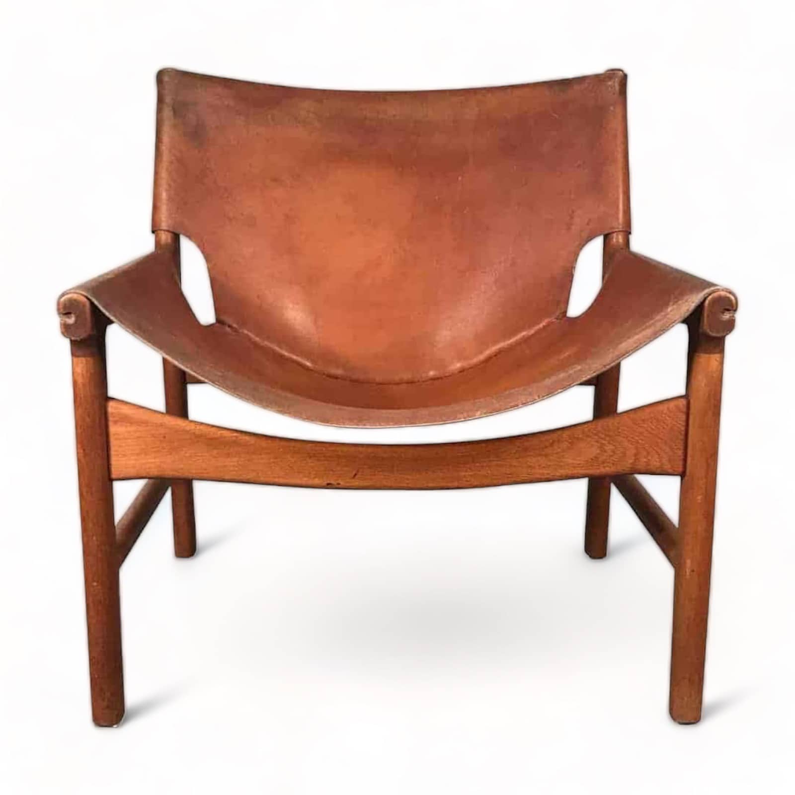
Illum Wikkelso (1919-1999) designed this mid century modern lounge chair for renowned furniture company, Mikael Laursen. It is made in Denmark in the late 1950s. The “Easy Chair Model no.103” is incredibly comfortable and features a cognac colored leather seat on a teak frame. The chair is in very good, original vintage condition.

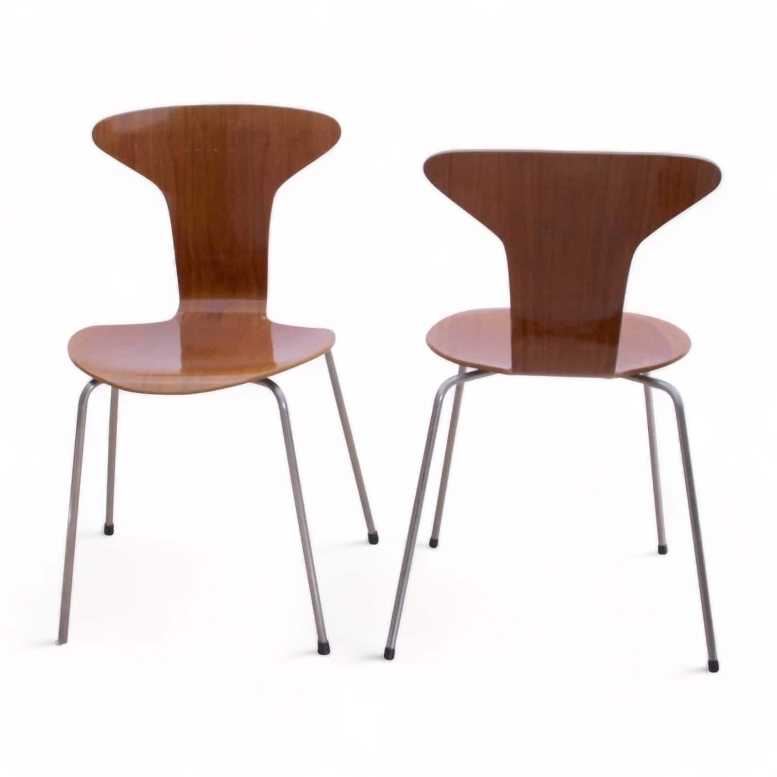
Choosing the right dining chairs for your kitchen or dining room is critical. Scandinavian Mid-Century Design Chairs offer excellent choices. This beautiful pair of 3105 “Mosquito” chairs, or “Munkegard” chairs, were designed by Arne Jacobsen in 1952 for Scandinavian furniture company, Fritz Hansen. They would compliment a variety of styles of dining tables, whether round, square or rectangular. The set and back of the chairs have a teak veneer on curved laminated wood. The chairs feature an old polished finish.

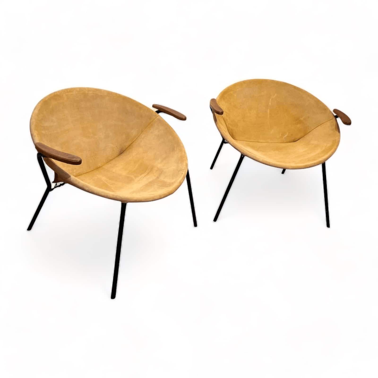
These stunning pair of balloon lounge chairs, designed by Hans Olsen in the 1960’s, add a touch of Mid Century Modern elegance to any space. The chairs boast a striking combination of an original yellow suede leather seat along with a sleek black lacquered metal frame. The chairs are both functionally comfortable and stylish with oiled solid teak armrests grace each side. With their timeless appeal and impeccable detailing, these lounge chairs are a testament to the enduring allure of Danish design. These stunning vintage lounge chairs are also available today on Styylish.

Sideboards
Scandinavian design sideboards showcase sleek profiles and functional storage solutions. Materials like teak and rosewood are commonly used for the veneer, while minimalist handles and geometric shapes contribute to the overall design. These sideboards seamlessly combine form and function, becoming a focal point in any room.
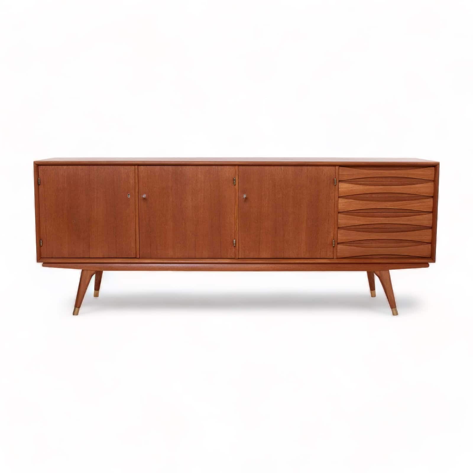
This exquisite Sven Andersen sideboard, crafted by this renowned designer and manufactured in Norway during the latter half of the 1950s, is a testament to mid-century Scandinavian craftsmanship.
The sideboard boasts three elegantly designed doors that open up to reveal ample storage space. On the right-hand side, it offers six drawers for your organizational needs. The teak frame of the sideboard exudes timeless beauty and is complemented by all four legs finished in brass, adding a touch of sophistication to its overall design.
This functional yet beautiful piece stands as a testament to the enduring appeal of mid-century Scandinavian design and craftsmanship, showcasing the beauty of teak wood in all its glory.

Bringing Scandinavian Mid-Century Design Home
Incorporating Scandinavian Mid-Century Design into your home is more than a design choice; it’s a nod to a rich history of fine craftsmanship and innovation. From its post-war origins to the creation of timeless masterpieces, this design movement has transcended boundaries and left an indelible mark on the global design landscape.
As you explore the possibilities of integrating Scandinavian Mid-Century pieces into your living space, you embark on a journey that celebrates the enduring beauty of thoughtful design—a journey that seamlessly bridges the past and the present.

